

This guest bathroom was one of the first rooms we tackled in the house, and it was amazing to really explore bold design ideas now that we were in our first home we knew we were going to be in for the long haul. We love cool tones, so the green we picked was definitely our style – adding in the gold was a leap of faith.
For this project, we wanted as drastic a change as we could get, without touching the counters or floors. I am pretty outspoken about my dislike of beige, but I’m learning how to incorporate it and not fight it too much.
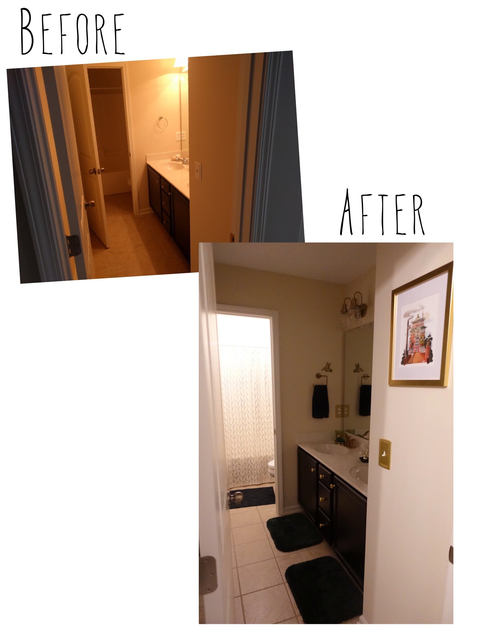
As a side note, this bathroom gets zero natural light, so my pictures are a little more all over the place than usual.
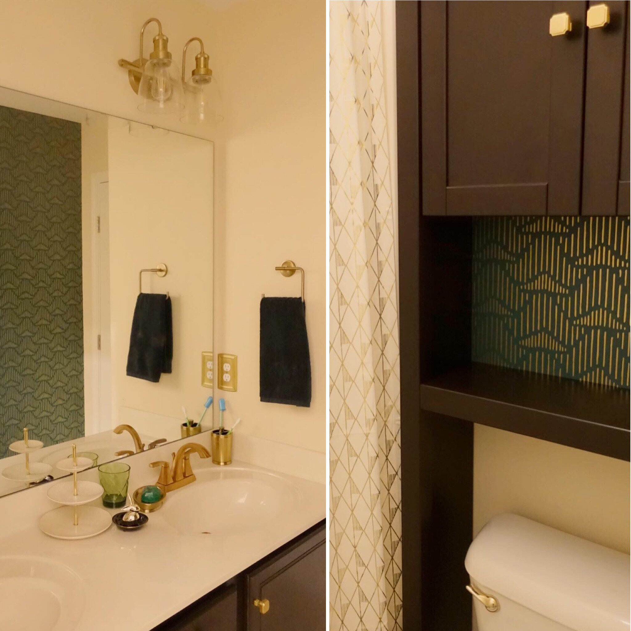
This wallpaper was the focal point for this room, which is a little funny because you mainly see it in the mirror.
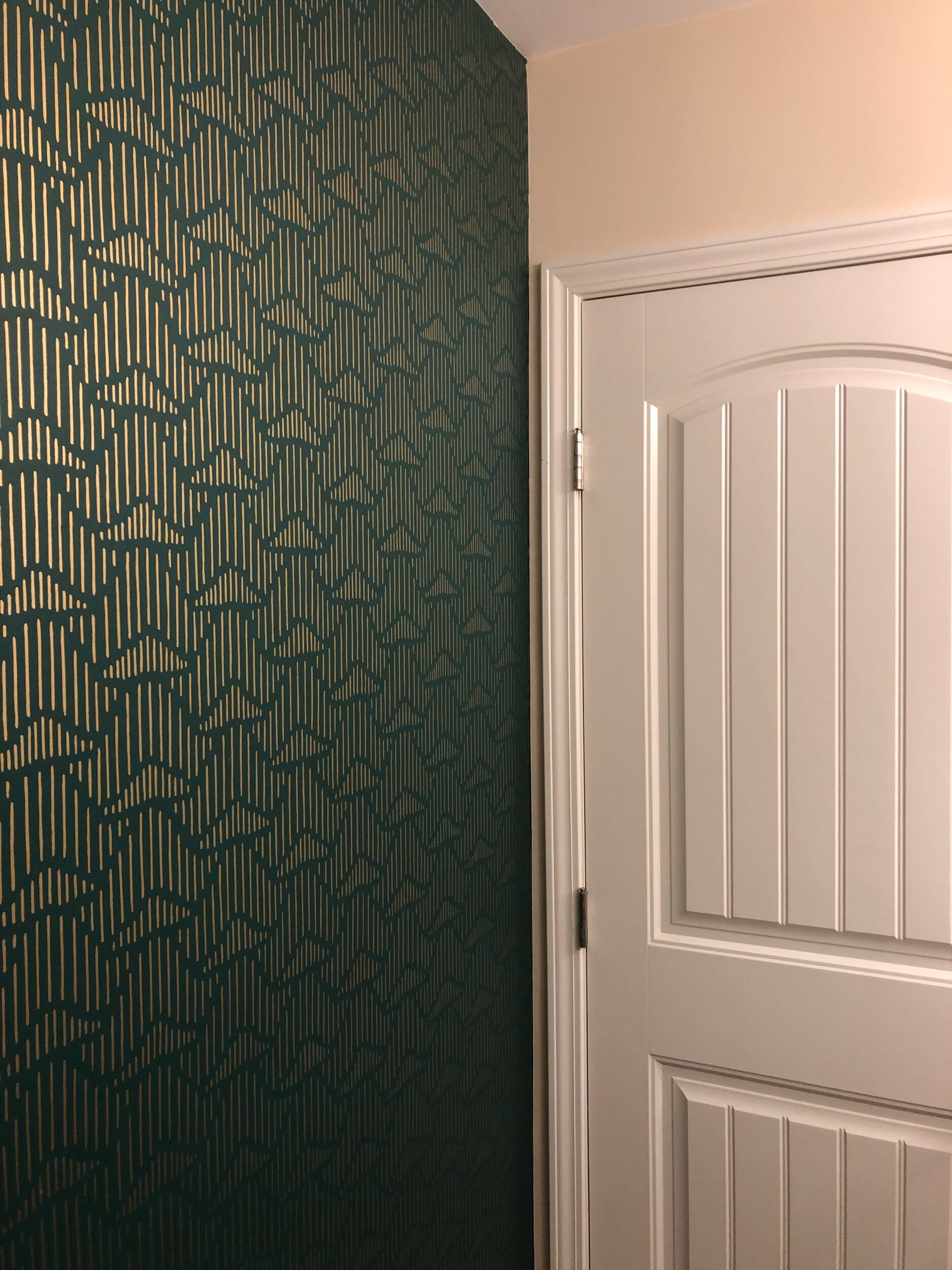
The wallpaper we chose is Palma, by Hygge & West. Originally we had looked for removable wallpaper, but I just wasn’t able to find one in a style I liked that also had metallic gold rather than just goldenrod as a color. Our amazing paper hanger did use paste that should make it easier to remove if we ever want to, but I’m still head over heels in love with this feature wall.
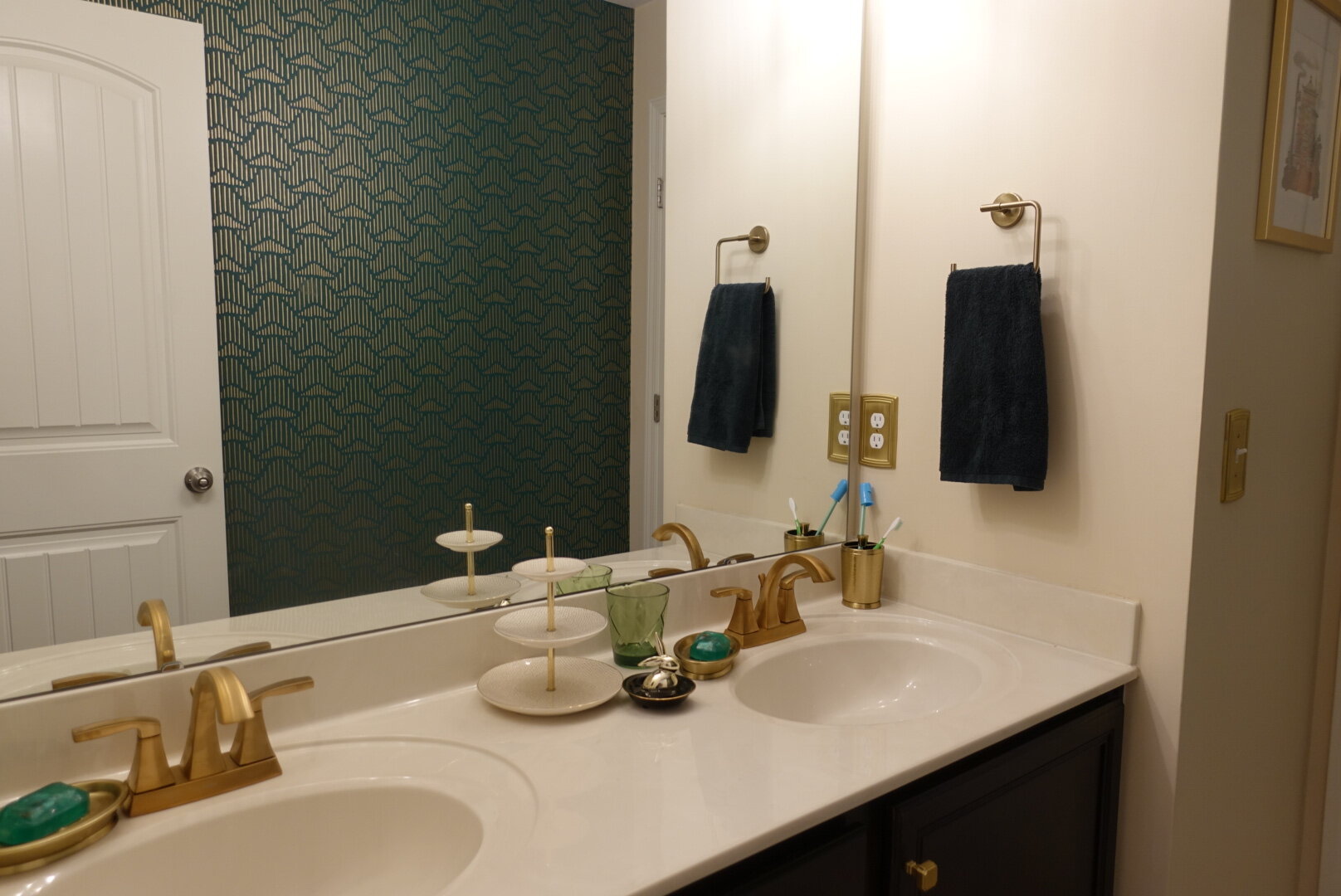
Once we had the statement wallpaper selected, we turned our attention to the double sink vanity. To keep a modern feel, we tried to select gold fixtures that had strong straight lines and bold profiles. These Moen Voss Brushed Gold faucets were my husband’s first foray into faucet replacement, and I think they turned out awesome!
- Emerald Soap – AnjoulBliss on Etsy
- Cabinet Knobs – 1 1/8 Length Square Knob from Liberty
- Soap Dishes, Jewelry Stand, Hand Towels, Toothbrush Cup – Target
- Towel Rings – Trinsic Open Towel Ring in Champagne Bronze from Delta
- Ring Holder Bunny – Home Goods
- Water Glasses – 15 oz. Green Old Fashion Glasses by Certified International
- Switch Plates & Outlet Covers – Hampton Bay
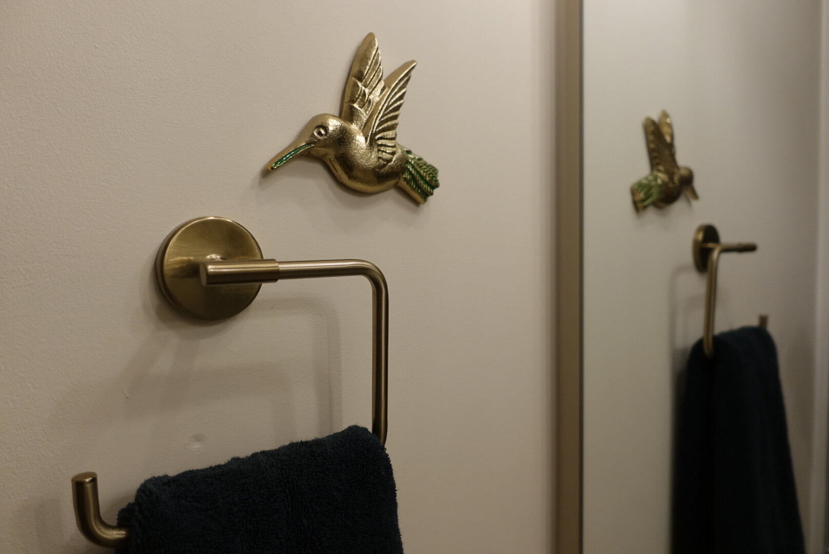
This little hummingbird we discovered while on a trip through Target felt like the perfect little addition.
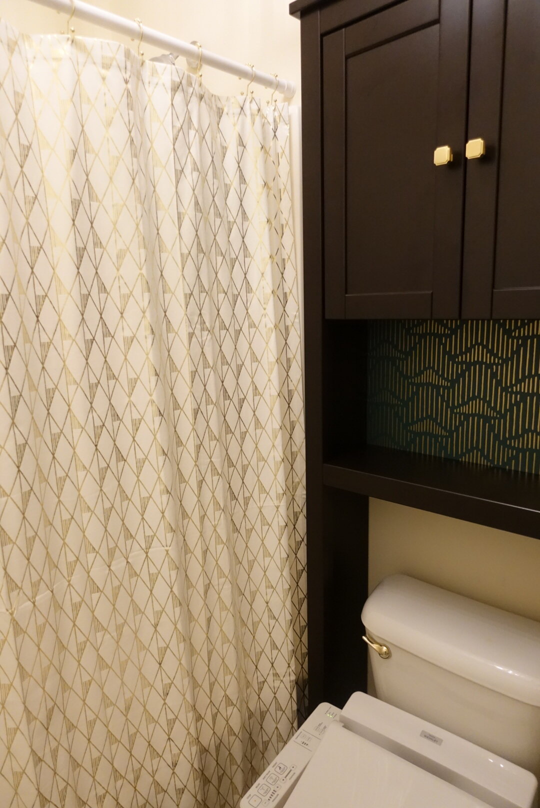
We used some of the extra wallpaper we had as a pop of color on this IKEA HEMNES bathroom cabinet. Applying it without getting any bubbles made us even more appreciative of the help we got putting it up on the wall. Also, here you can see that we used the same knobs here as on the vanity cabinet, just to pull everything together. The shower curtain is by Project 62 from Target, and the gold geometric foil print ties back in to the wallpaper.
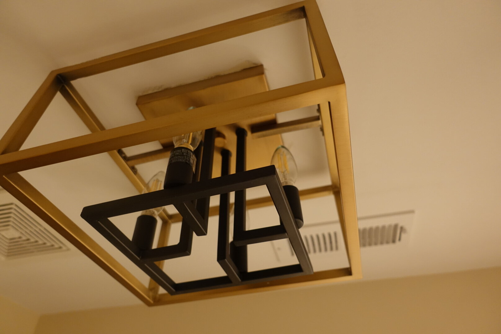
I get really nerdy about light fixtures – this Bedsworth 4-Light 13″ Caged Square Flush Mount from Ivy Bronx is definitely in the top three. It’s off in the side room with the shower, and the black and gold plus the strong sculptural lines just make me giddy.
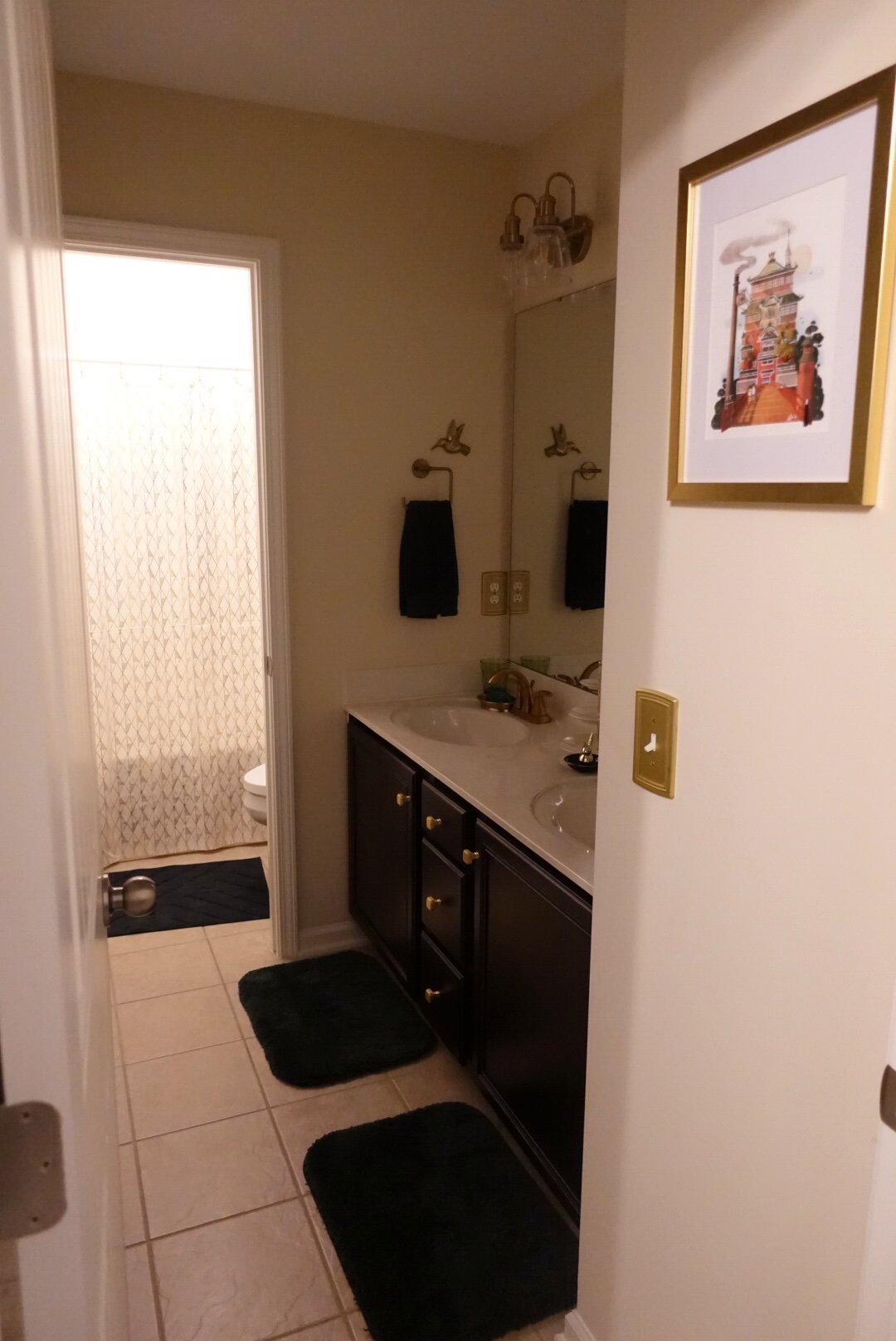
Finally, there is at least one geeky element in every room in our house. Here, it’s art inspired by the bathhouse in an anime we both love. The bright orange-red pops against the green and gold, and it just fits the theme. This shot also highlights the new vanity lighting. The Dirksen vanity lights from Breakwater Bay are just a little curvier than most of the other elements we picked, but the knurling on the fixtures and the seeded glass shades brought in just enough of that industrial touch.
So, with this being our first big design project – we learned a lot. Matt went out on a limb with me to these bold colors, after I did a lot of Pinterest searching to show him some of my ideas. I did end up going a fair bit darker on the green for the towels and rugs after showing him a few options, just to keep it from being too overwhelming. I learned that even the smallest things should probably be measured, after my first set of bath mats didn’t fit based on just my guesstimates. Also, this cemented my love of statement light fixtures and wallpaper! I think the biggest thing I learned is that I have a passion for designing, and I’m glad that as a team we were able to pull off this project that turned out even better than I could have imagined.
