

This is my reveal post for the Spring 2023 One Room Challenge. We didn’t end up finishing by the deadline of May 29th, but the bathroom is now done and having the One Room Challenge to push us to get started and keep moving was a huge help.
All the guest participant links can be found on the One Room Challenge blog! You can also visit the week 8 link up page directly to see everyone else’s reveals!
This post contains affiliate links, labeled after the link. If you use the links to buy something, I may earn a commission, but there is no extra cost to you. I do my best to only link things for house projects that we’ve used ourselves and liked well enough that we would use them again. Thanks!
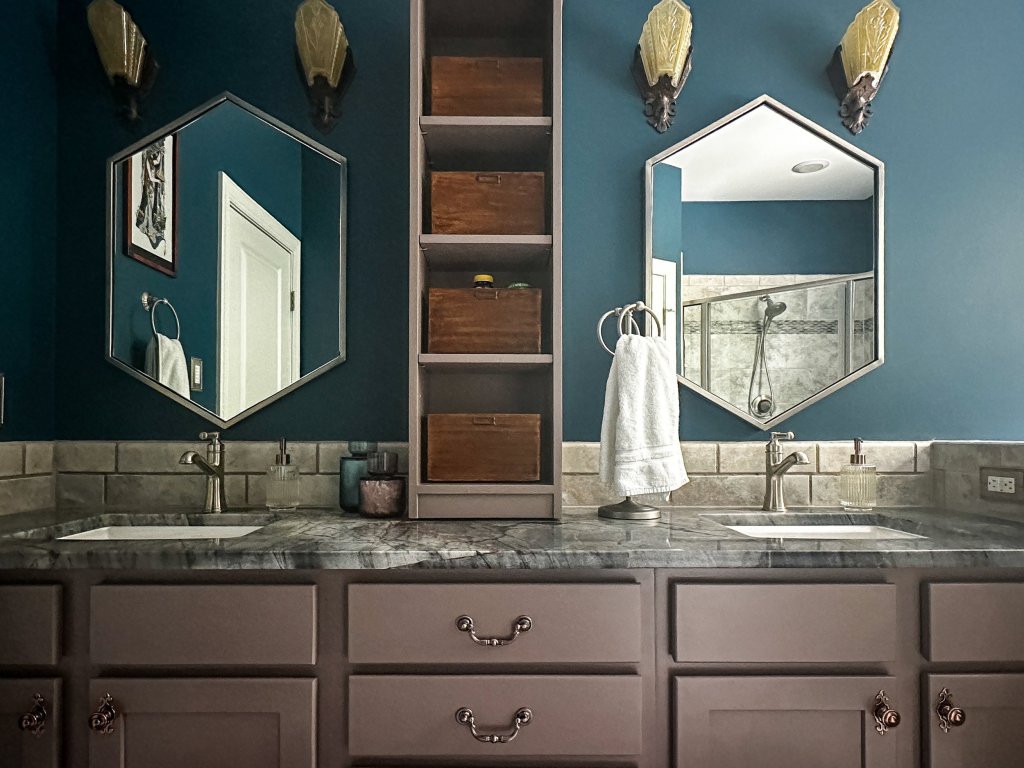
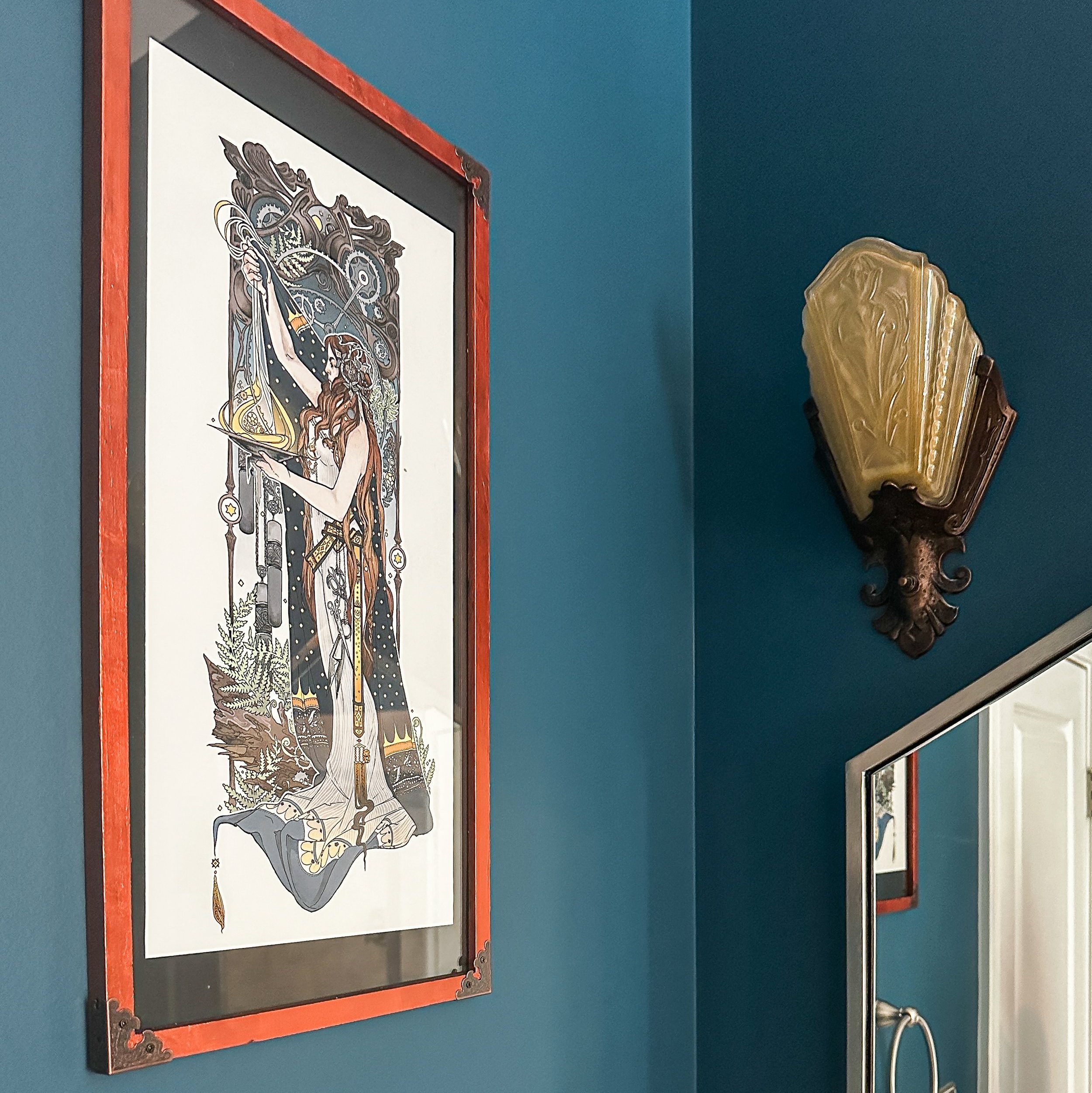
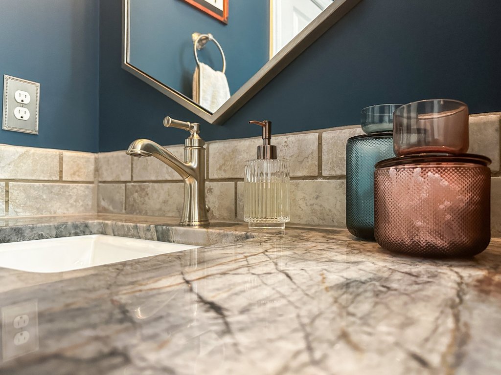
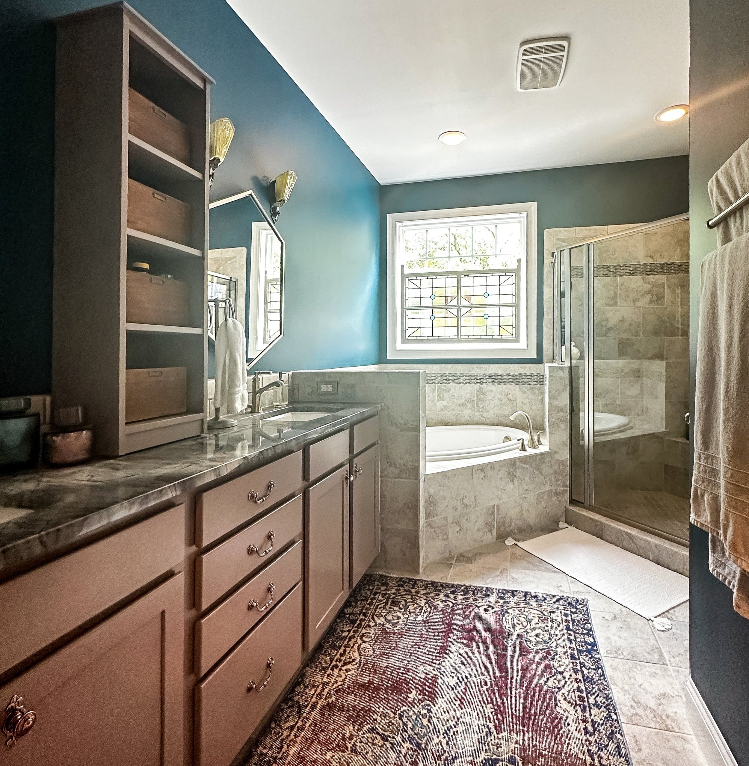
The wall color was the very first thing we decided on for this room’s design. Even though I know that’s usually not the recommended order, it was worth it for us in the end. Gemini Season is an absolutely gorgeous color, a dark blue that leans towards teal in some lights and looks almost navy in others. The copper lights and picture frame really shine against that moody blue backdrop.
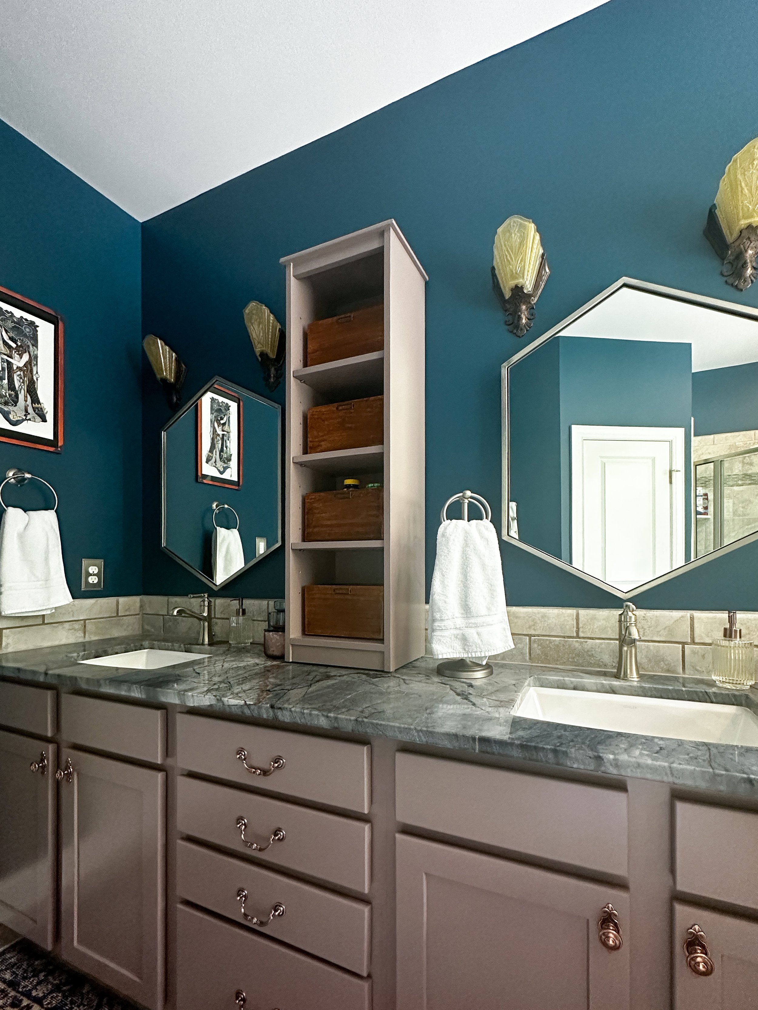
Speaking of the metallic elements – we’ve never used copper and nickel in the same space before, and we were mixing antique shapes with more modern ones like the hexagonal mirrors. I think largely keeping vertical layers of each metal helped things feel less chaotic and more balanced, although I did sneak some copper in with the soap dispensers on the countertop.
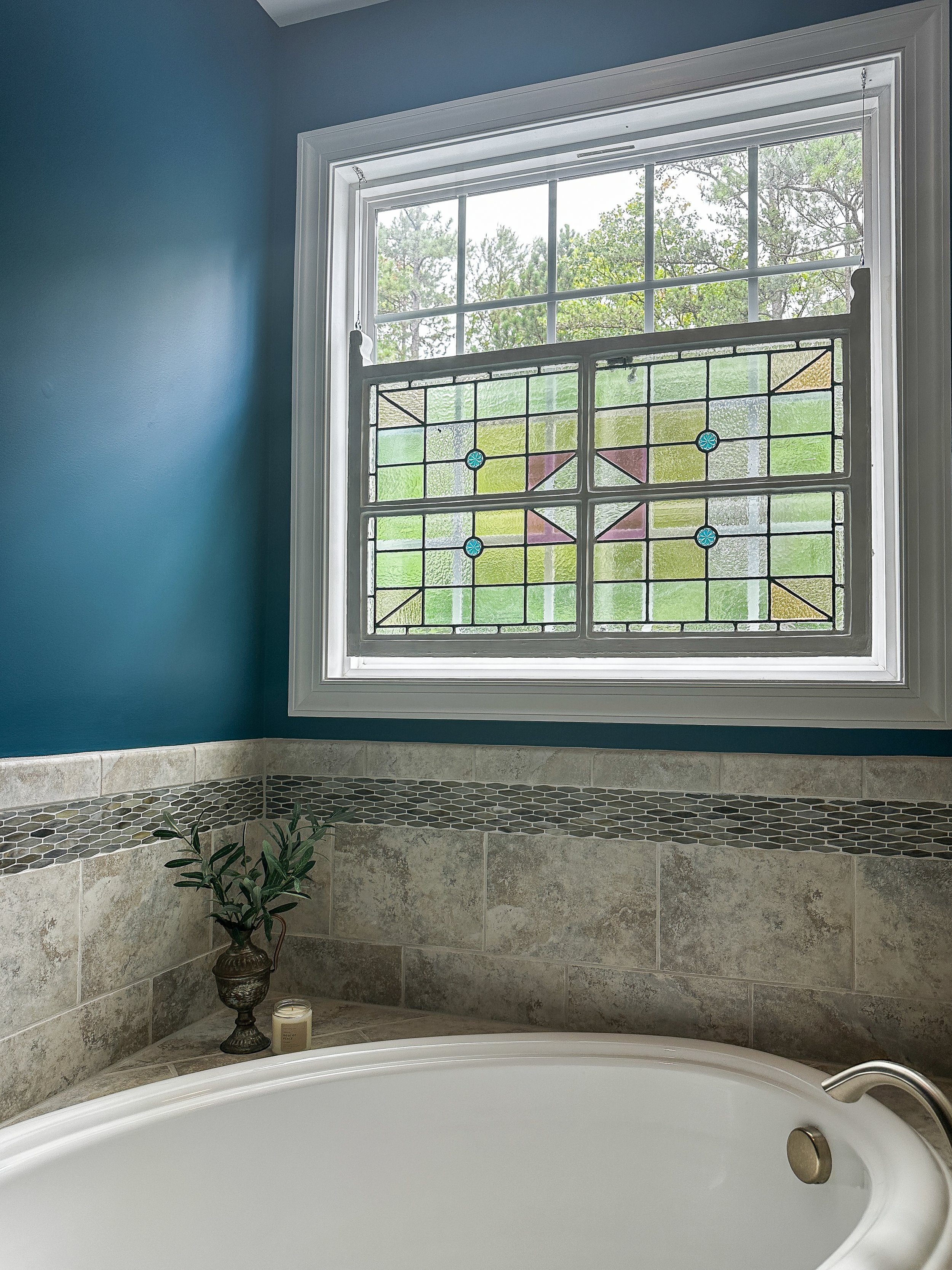
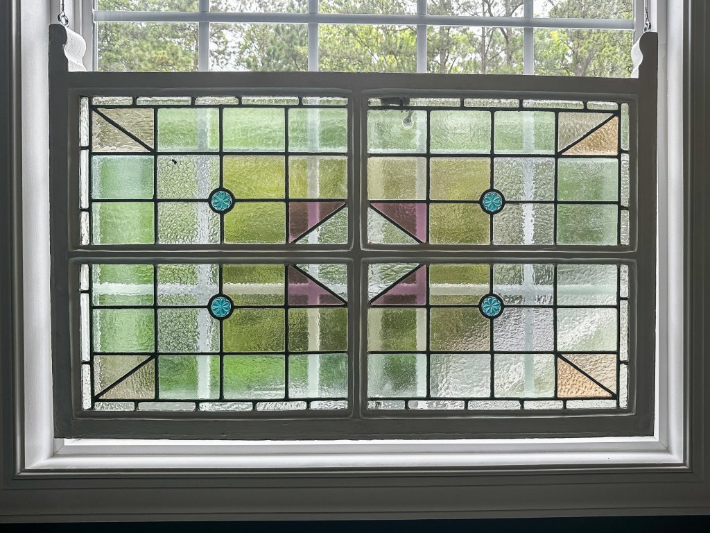
This window looks right over our neighbor’s driveway, so we wanted a way to keep the bathroom private while not making the bathroom too dark. We found this salvaged stained glass window on https://leadedstainedglass.com/, and it was shipped safely all the way from the UK! We tested for lead paint and encapsulated all the painted parts of the window, then hung it from the frame with gallery hanging hardware. Even the clear glass has a lot of texture to it, so it’s the perfect mix of privacy and beautiful light-filtering.
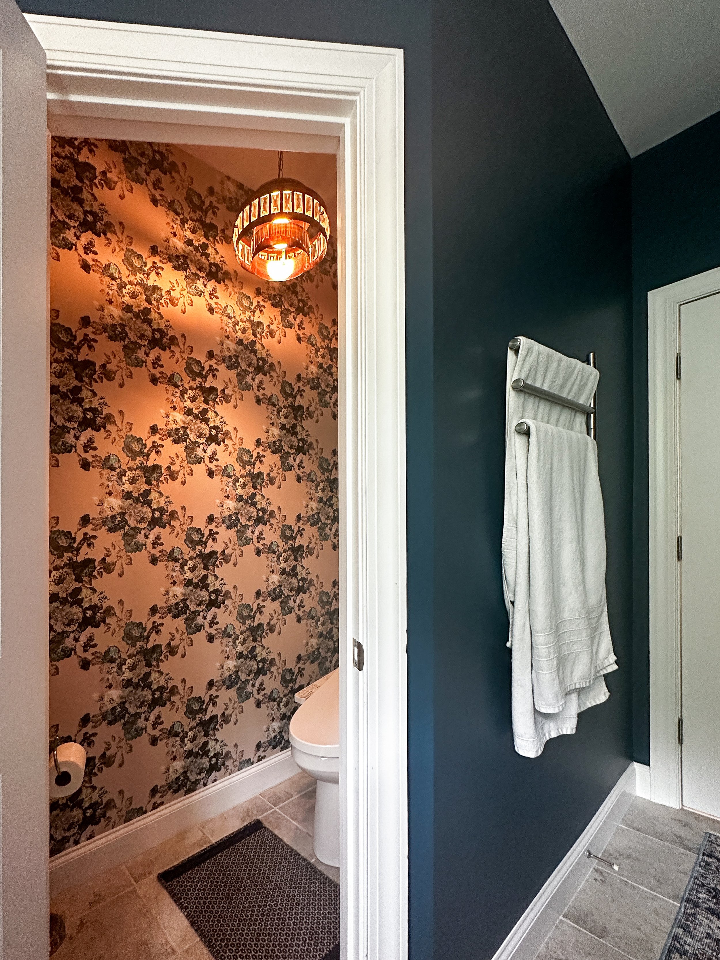
While the painted walls in the bathroom are moody and calm, the wallpaper in the water closet is bursting with florals and ornate details. I love how it picks up the same deep blue color in some of the rose blooms.
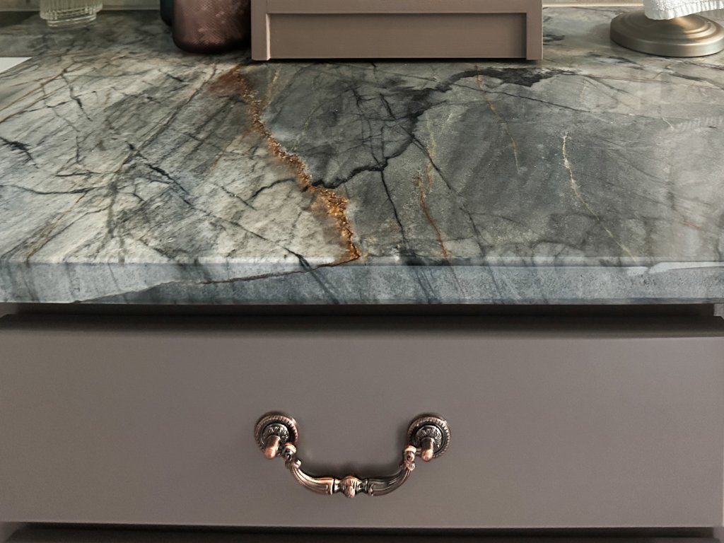
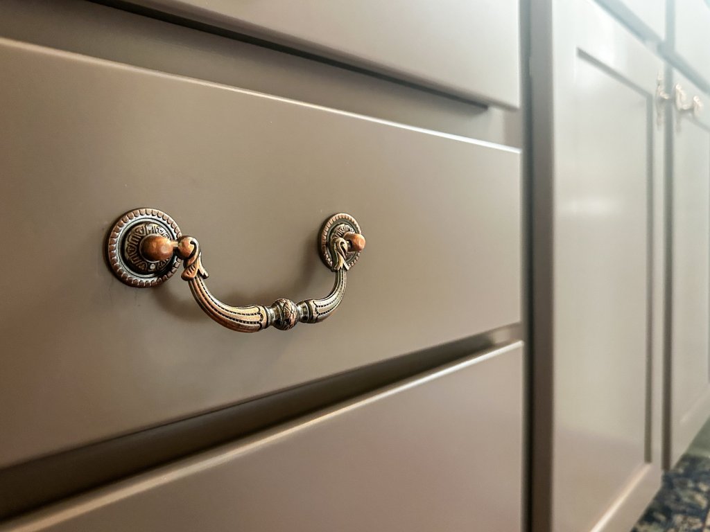
I feel like I could fill so much of this page with detail shots, but I’ve picked a few of my favorites here. So much of this space feels like calls and responses to each other, whether it’s the coppery veining in the countertop or elements reflecting in the mirrors.
Also, I have to say, for a quick transformation, copper paint plus these corner brackets (affiliate link) transformed a basic black frame into something that feels made for this space.

One day, I will get a before and after shot from the same exact spot. Today is not that day, and besides, how could I leave out the new-to-us rug in the after shot? I actually had a more neutral rug and this saturated vintage rug, both from Revival, waiting in the wings, as I wasn’t sure what the room would need most after all the painting was done. Tying in the purple from the stained glass window to the other side of the room was an added benefit of the bolder of the two rugs, plus I rarely turn down the opportunity to add more color.
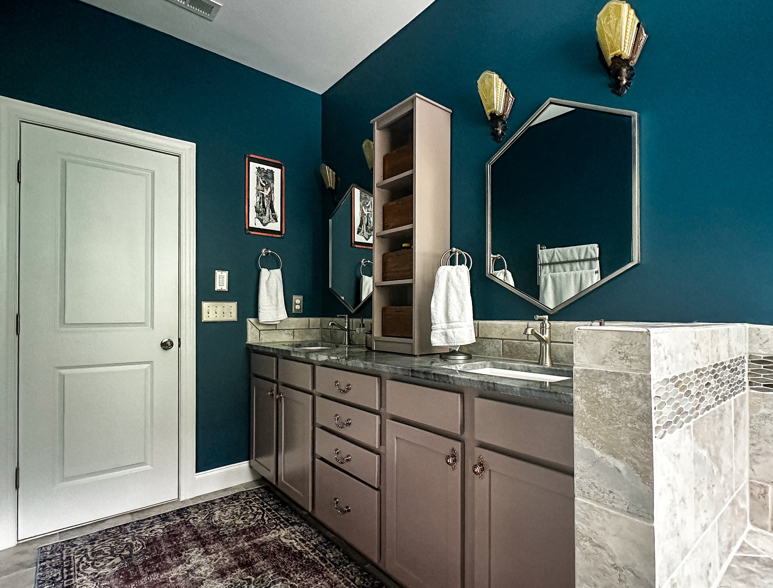
The new Delta towel ring (affiliate link) on the wall is a much better size for the space, and after learning Matt’s preference for having a ring-style holder, I paralleled that with a countertop towel holder (affiliate link) that works perfectly beside my sink. Little touches like that, and the standing cabinet we added between the mirrors, make me glad we lived with the bathroom and learned what needed to change to make daily life easier before we did any updating.
Our cabinets were painted in Sherwin Williams paint color-matched to Hound Paint’s Cinnamon Sticks, and they are even better than I imagined. If you remember my cabinet door adventures from our laundry room – I’m happy to say that our painting crew did an amazing job making sure the painted cabinets didn’t have any grain showing through and had a durable, super-smooth finish. We did want to bring a little wood tone back into the room once the cabinets were painted, so I stained paulownia wood boxes with Canadian Maple water-based stain (affiliate link) to add that warm touch. Adding these little antique copper label holders (affiliate link) completed the antique transformation of the storage boxes.
In the end, this may have taken a couple more weeks than we’d originally planned, but to see all the pieces of the puzzle put together is so worth the wait.
