The Vision
I love reveal posts – and maybe not for the reason you think. It is exciting to see the final design fully completed, but the real joy for me is looking back to the beginning and seeing how much has changed. Especially for a project like this, where we were pretty remote, and many design reviews were happening over video calls, it could have been easy to miss just how big of an impact we made.
So, I want to share our inspiration, talk about some of our finishing details, and then do that before and after (because this blog series has been kind of drawn out, too, and you might not remember just where we started, either).
Here’s my Pinterest board for this kitchen – you can see the different options I was considering for cabinet hardware and backsplash tile. Plus, check out the many, many (many) two-tone neutral kitchens I pinned, trying to get an idea for the overall design direction.
The Details
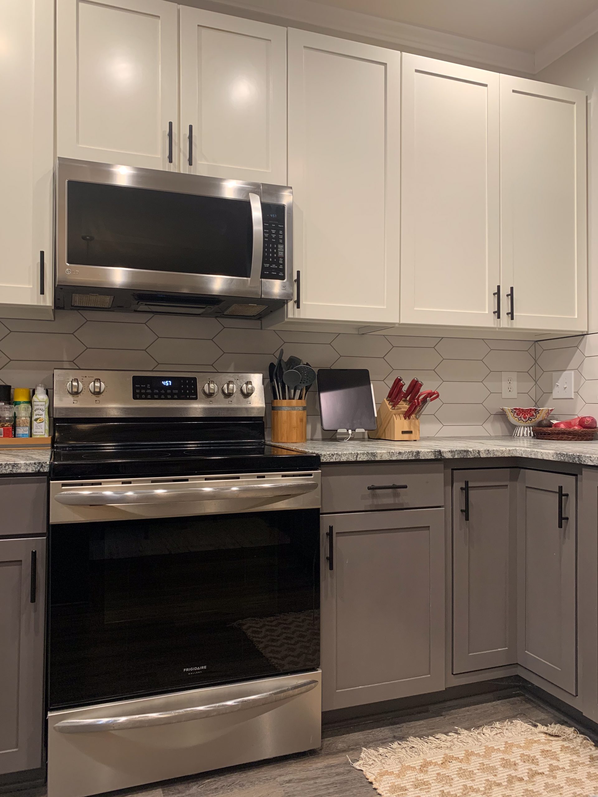
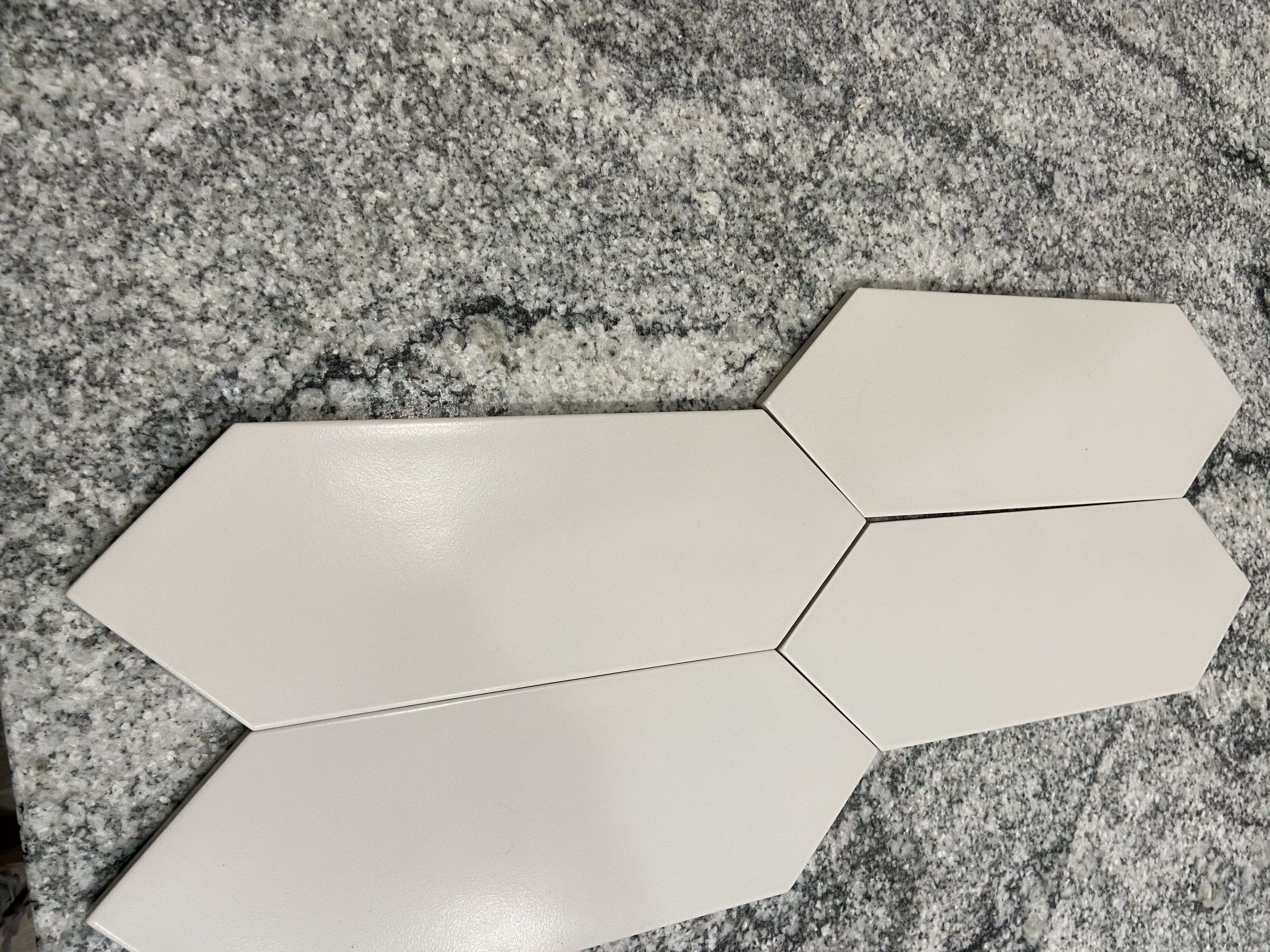
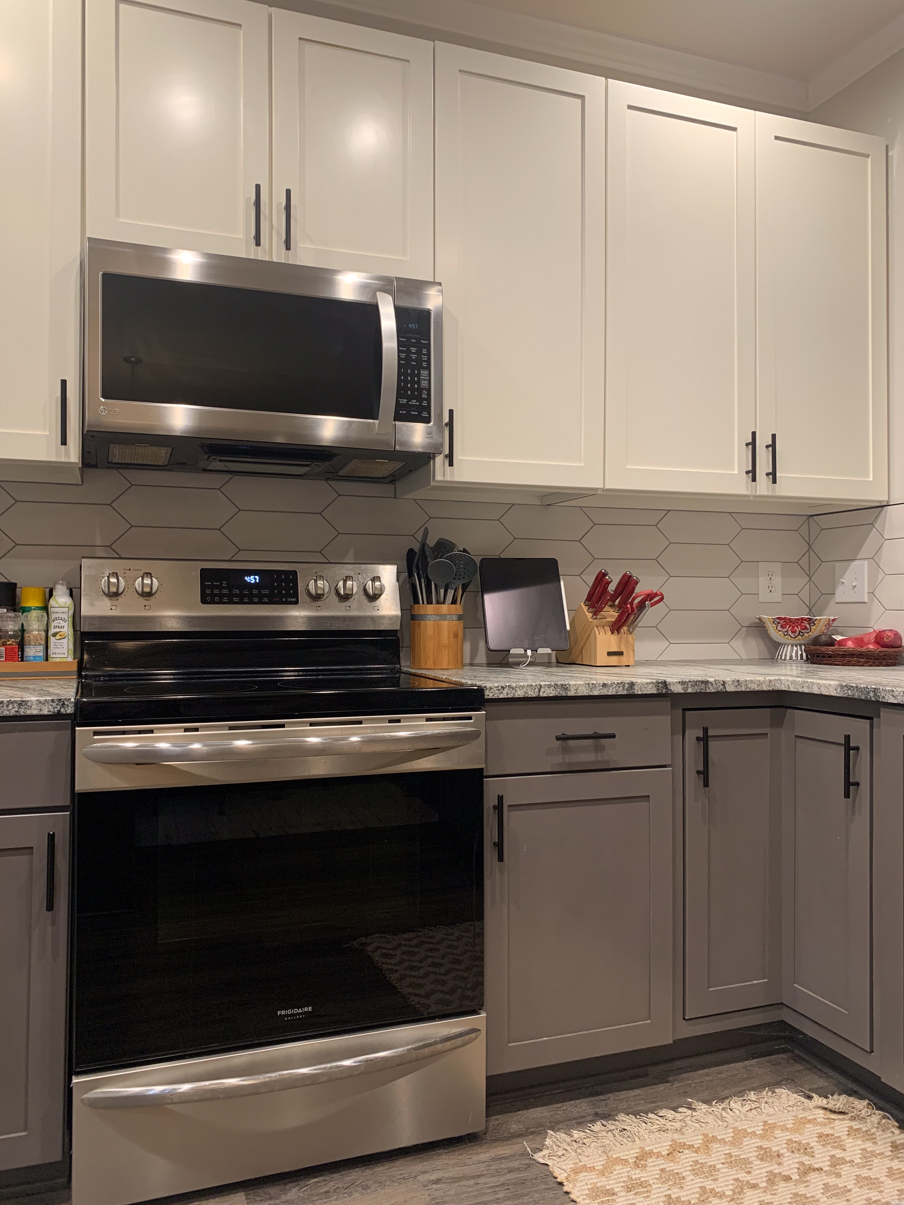
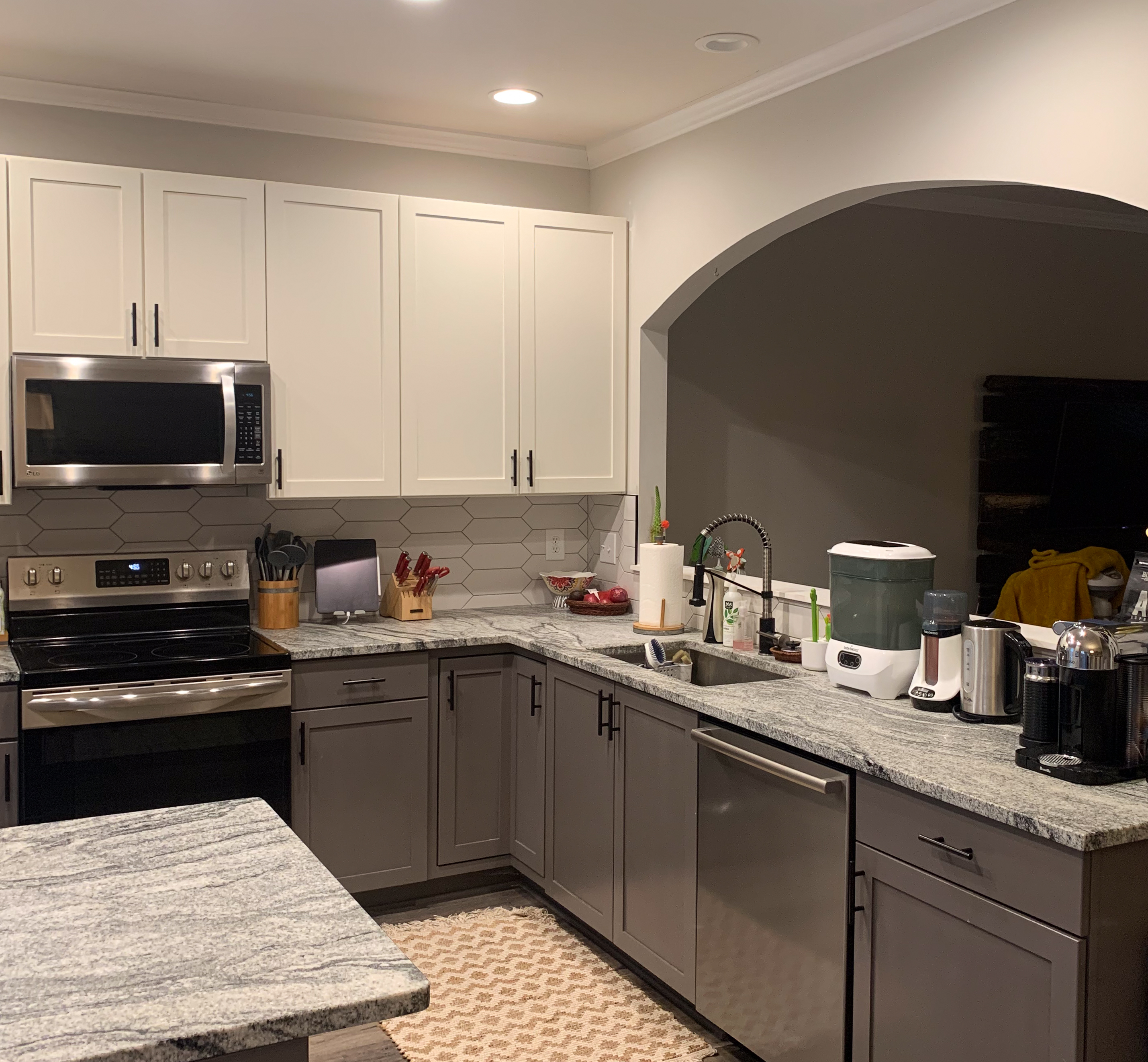
We wanted a backsplash tile that was neutral in color but still had a lot of visual interest. (This is definitely a theme across the board in this kitchen!) These off-white picket fence tiles, with a subtle sheen, were just the ticket. We used a medium gray grout to make sure the lines of the tiles were highlighted rather than hidden.
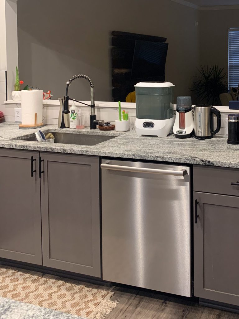
We picked matte black cabinet hardware that was substantial enough to stand out against the lower cabinet paint color. We used the same handles across the cabinet doors and drawers and just rotated them horizontally for the drawers. This gave us a great consistent accent note, and we were also able to pull through another neighboring project later!
Matte black was our main accent metal, aside from the stainless steel on the sink and appliances. It was repeated on the faucet detailing, which brought a bit of style in with the vastly improved function. Speaking of improved function – this kitchen started out with a sink that was basically the depth of a coffee mug. We picked a single-basin, straight-sided, and DEEP sink to really make this kitchen work better for the family.
It might not be the most glamorous change, but it was so needed. We had an electrician replace the fluorescent fixture with bright white can lights! You’ll probably be able to catch a glimpse of that in some of these “after” photos.
The Transformation
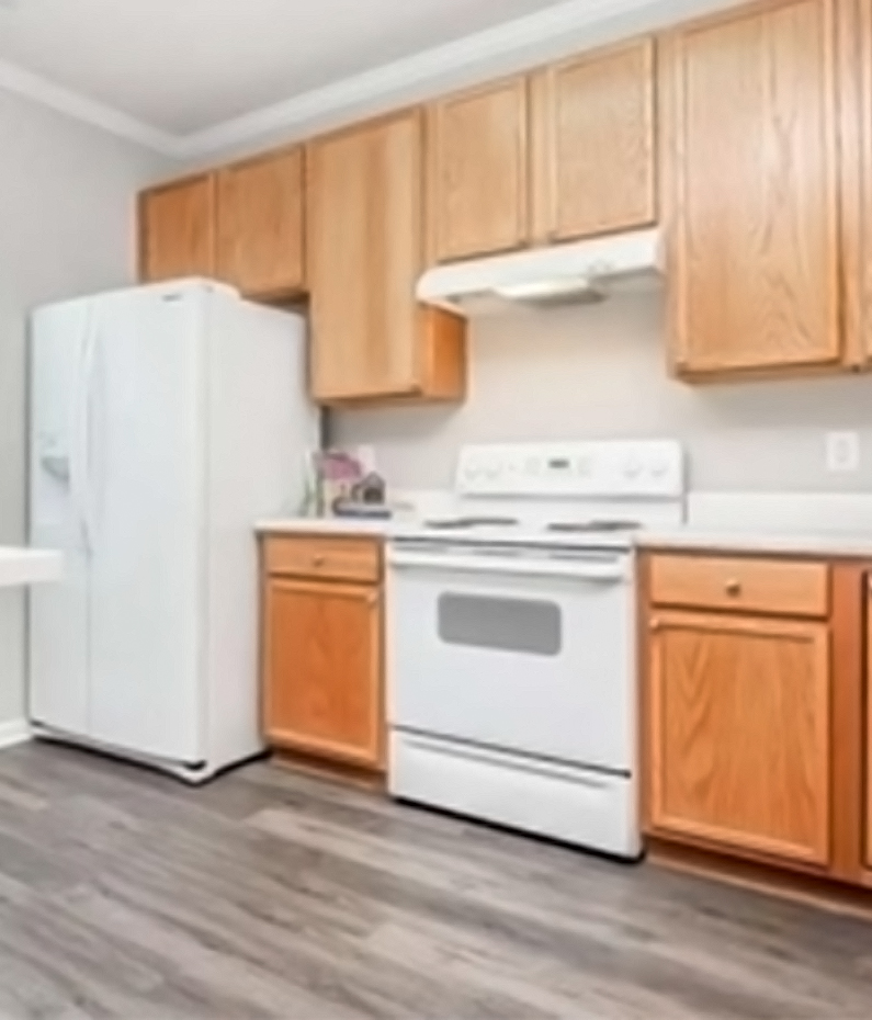
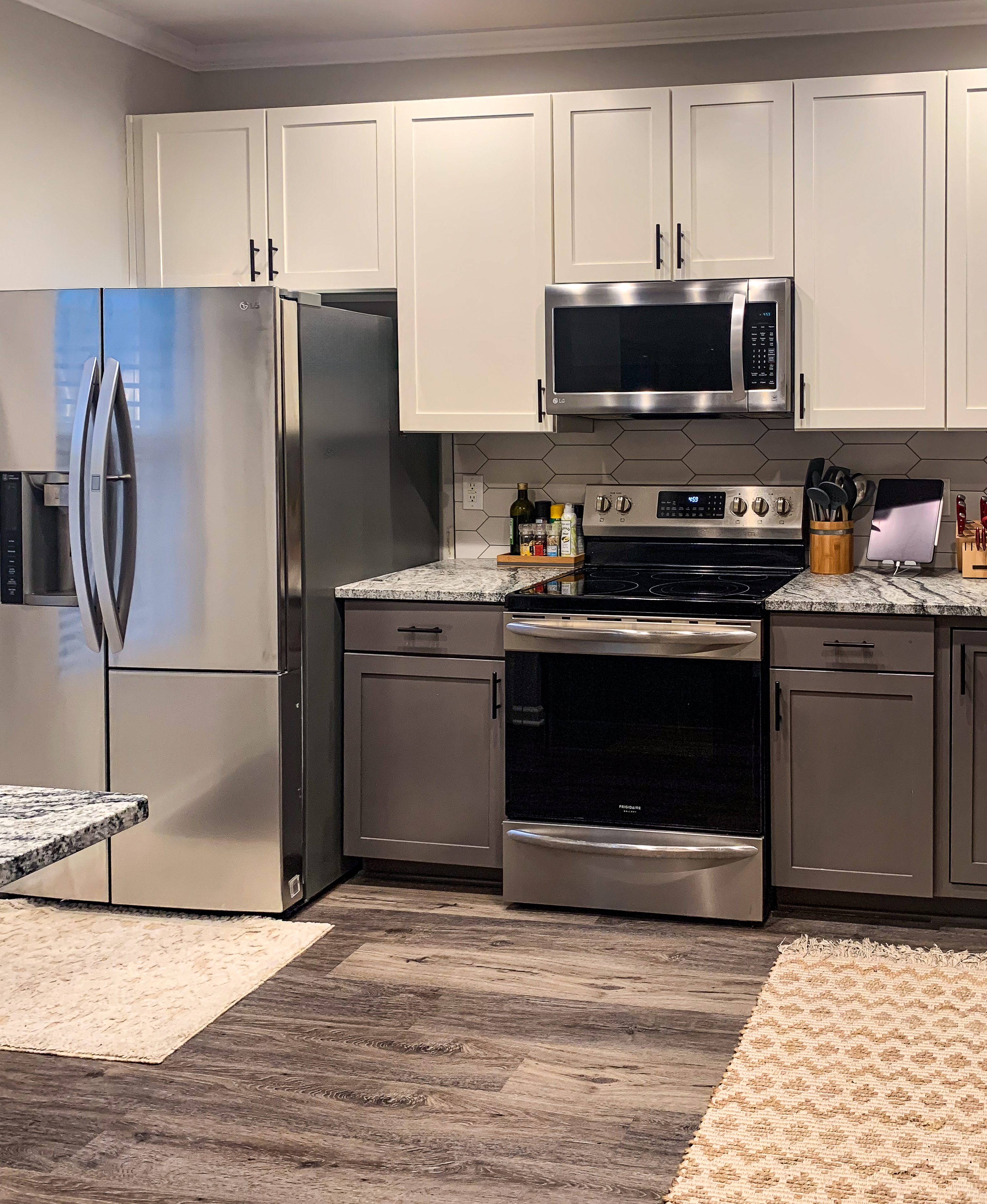
It’s actually incredible to me how much warmer and more welcoming the kitchen feels now. We didn’t change the floors or paint the walls, but the more cohesive design makes those pieces fit into a picture that makes more sense.
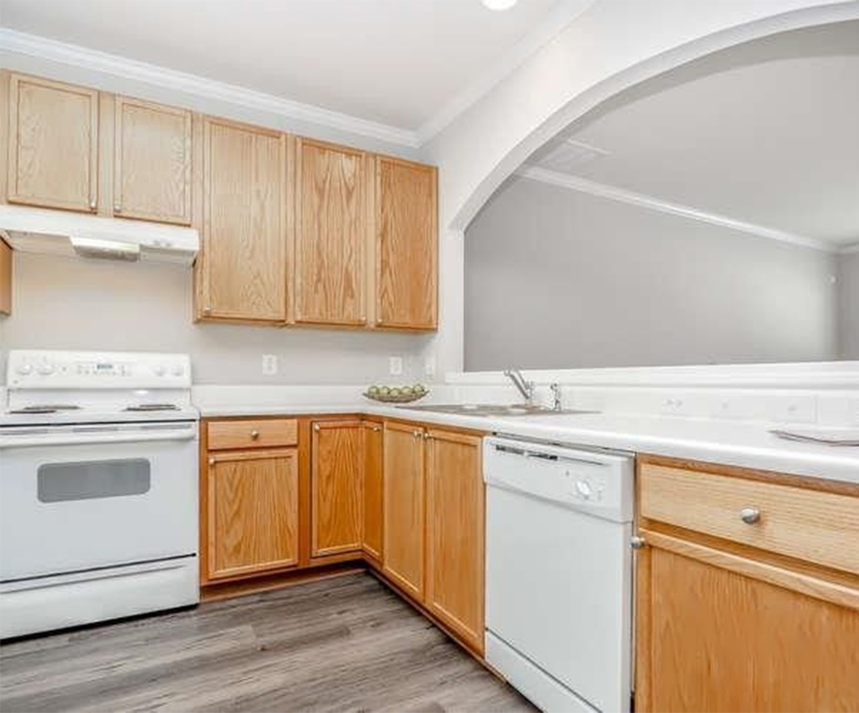
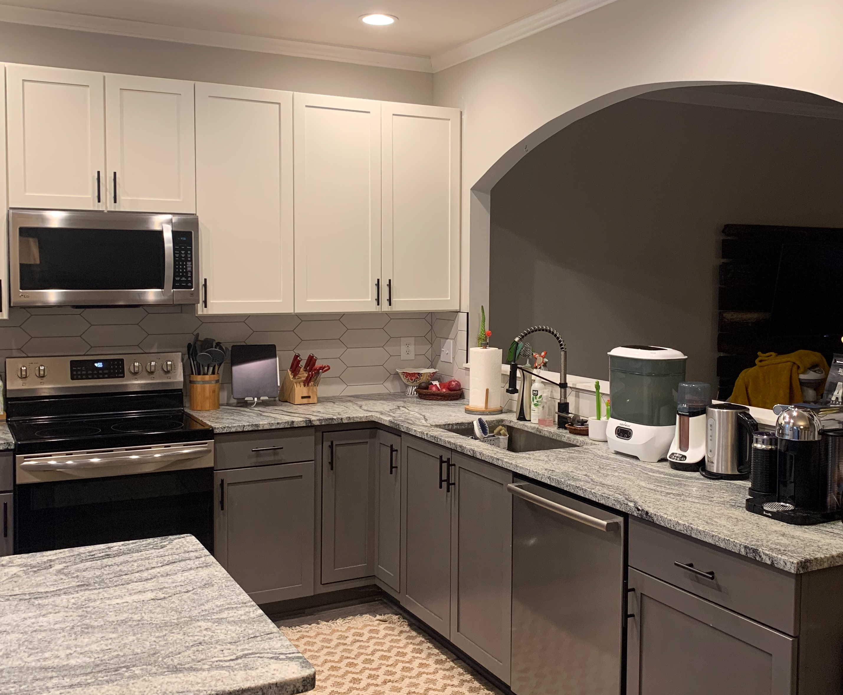
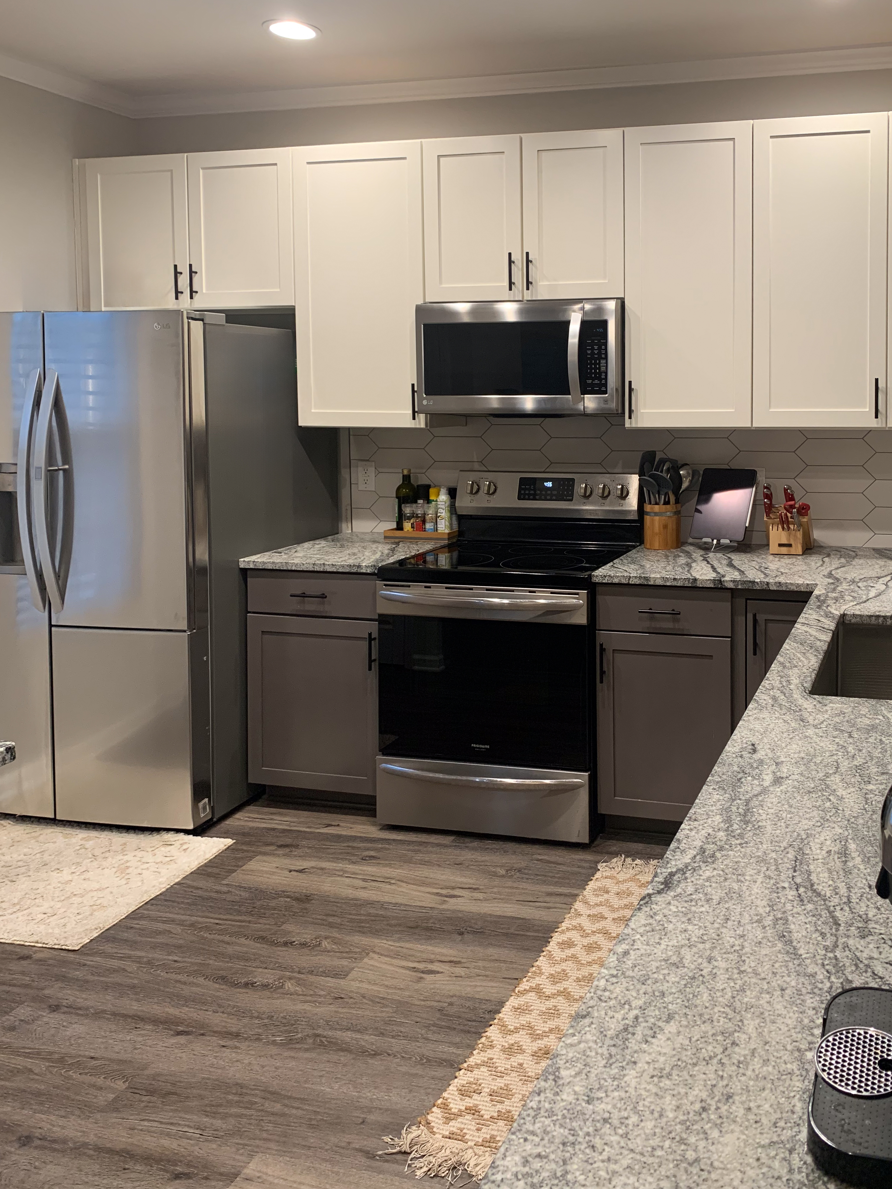
I don’t know if I can pick out one aspect of this renovation that was my favorite—I love just how all the elements come together for this cozy, neutral space with so many nifty details. (Okay, and also because it feels like cheating to always pick the stone as my favorite for projects that have it.) Do you have a favorite or one you want to know more about? Let me know in the comments!
Leave a Reply